Who Dressed Best? Week 2 Uniformity
All things considered, this was a pretty gorgeous weekend in the NFL. We saw two throwbacks (Bills and Bears) and a generally nice looking slate of games league-wide. There were, of course, a few games that stood above the rest, but before we get there, I need to introduce an exciting new feature. Since the Packers are obviously the best clad team in the NFL (okay, I'm biased, but I think they're up there, regardless), it's difficult to ever exclude them from the uniform rankings on a weekly basis. So instead of always including them in the top three games for a week, we'll rate each Packer game on its own merits, followed by the best three games of the rest of the league, then concluding with the worst game. Deal? Deal.
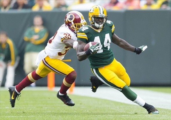
Packers vs. Redskins
A great match-up of two of the most historically good looking teams in the league. Sure, there's a lot more yellow around since the 'Skins brought back their yellow pants, but that's not always a bad thing. I rate this eight out of ten cheeseheads.
Best of the Rest
1. Bills vs. Panthers
The Bills brought out their terrific "Standing Buffalo" throwbacks, and even though their current set pretty much looks the same, the throwback still looks amazing. I like the simplicity of the helmet, and I think it shows that you can still have a neat design without having an angry looking animal as your logo. Plus, with the Panthers badly in need of a remake, the Bills just look that much better.
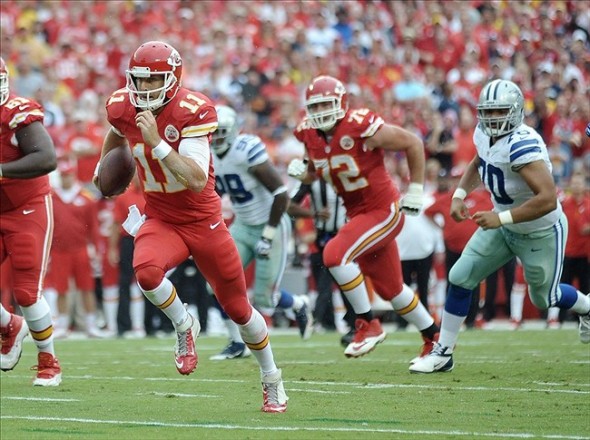
2. Chiefs vs. Cowboys
I wanted to hate the Chiefs red-over-red look. I'm on the record as saying the quickest way to look like a Division III college team is to wear color over color. But somehow, I can't bring myself to dislike the Chiefs' look this week. Maybe it's the shade of red. Maybe it's the nice contrast of the red and yellow with the Cowboys' blue and silver. I don't know. I just like it. Sure, it's not as good as the amazing color vs. color game from a few years back, but this looks pretty great to me.
3. Cardinals vs. Lions
Another red vs. blue game, but this one's less throwback-ish than Chiefs/Cowboys. In a vacuum, I don't particularly like either the Cardinals or the Lions. But together? It works for me. Not a bad looking game. Plus, this happened, which is ridiculous and awesome.
Not So Much
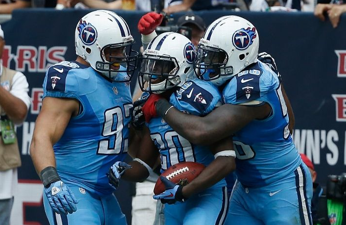
Houston looked fine here. My issue here is with the Titans, or more specifically with Nike. I shall explain. I don't dislike the Titans' powder blue on powder blue look. It's pretty unique and it's different enough to get past my "color-over-color" filter. However, there's a problem, and it has to do with the new Nike uniforms. Look at this picture and you'll see what I mean.
The Nike uniform template uses different types of fabric in different areas, and when players sweat, it changes the uniform color un-uniformly, which turns the jersey into a splotchy mess.
Now, Nike spent approximately a bazillion dollars (give or take) to be the new uniform providers for the NFL. It seems to me like Nike does care what teams look like. Why, then, haven't they fixed this problem? Google some college teams that Nike works with. You'll see this issue is basically endemic to Nike schools. It's poor design, it's lazy, and it just looks stupid.
End rant.


